
Earlier this week, the fabulous 13-going-on-27 Alex of Tales of a Teenage Booklover shared some beautiful fan art for Forgive My Fins, and I immediately begged him for permission to share them here on the blog. He said yes, and here they are.

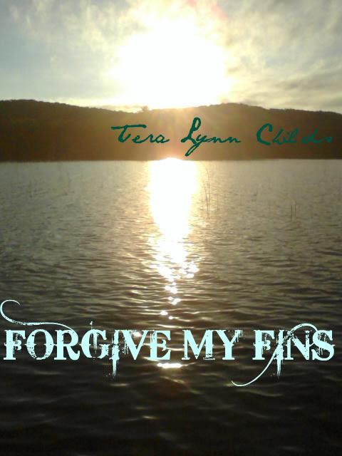
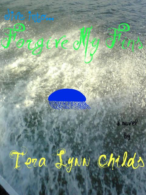
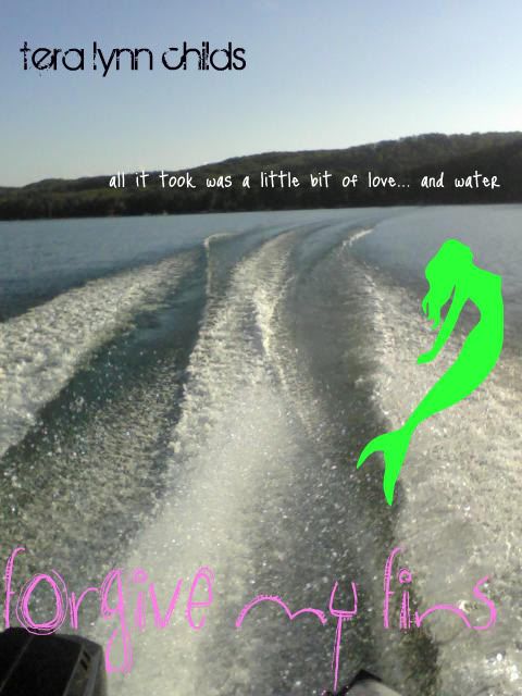
Alex also wants to know which one you like the best. (I like #3, by the way.) In honor of his efforts, and of the wonderful work of my Splash Team, leave your vote in comments and I'll pick one winner to get a signed copy of Forgive My Fins. (Open internationally and until I decide to close the contest.)
Hugs,
TLC
PS -- Alex took all those pictures himself! Aren't they gorgeous?
47 comments:
I don't know if this is cheating, but what the flounder! I really want that book so... I pick #1. I wish I had done something better with your name on it, however.
I like #1...looks like something moving through the water, quite lovely. I would love to win, but I'm gonna withdraw my entry cause I really think Alex should win =)
I keep going back and forth between #1 or #2...and just so you know, I'm not being greedy--If I won, I know an international reader who would be beyond excited to get a copy of this book!
Awesome pics Alex!
Awesome work Alex... My favorite is number 2 but I like all of them...
I like #1 the best, too.
alterlisa AT yahoo DOT com
http://lisaslovesbooksofcourse.blogspot.com/
Those are really beautiful! It's hard to pick but I really like #2. The #1 is my 2nd pick. Such great work! He totally deserves a copy of the book :)
The second one is SO pretty! I loved the font he used on the book title! It's great that the contest is internacional! Not so many do that and I'm almost always uncapable of participate and I reeeeallly want your book!
Cheers from Brazil!
I really like number two. It's a gorgeous shot and I love the font used for the title - makes it look mysterious yet elegant.
Margay
I like #3. The cover is serious yet goofy and light-hearted. The font just adds to the beauty.
Number two is DEFINITELY my favorite. Its so elegant and pretty and the font my dear Mr. Alex chose was PERFECT. Definitely drew me in.
Fantastic pictures, Alex. The first one is my favorite. I like the simplicity of it.
I'm glad Tera shared the link to your blog. I want to share it with my students next year to show them what they, too, can do with a blog.
I like the second one best.
P.S. love Alex. :)
I like #2 I like how the sun hits the water & the fonts.
I like #2
Great pictures- so hard to choose! But I think #2 is my favorite.
I like them all, but maybe #4 a bit more than the others!:P
i like the first cover the best :)
I like #4 the best, mainly because I like the design of the mermaid on it! Hope I win!
I absolutely love number 3. The mermaid on it reminds me of the part in The Little Mermaid when Ariel is changing into a human. I think that it's really pretty and I really want to win. XD
I meant to say number four, not three. I was just a little confused. But when am I not? Lol
I liked number 2 the best, but I like them all.
I like the second one best, I have a thing for sunsets and sunrises. :]
Definitely like #2 the best!
-Lauren
Oh, I absolutely love #1 XD It is wonderful!
#2 looks the best - its clean and effortlessly gorgeous
-Dahlia
I like the second picture, i think it's really pretty. Alex did great work!
I like the 4th one the best! I just like it!
Cindy
Great work Alex!
I like number four.
#1 really catches my eye :)
atomicxrawr@Yahoo.com
The first one , I really like the picture. I like the font on the 2nd one too
okay.. so even though they are all great looking, i have to say that #1 strikes me the most.
I'd like to congradulate Alex on doing ssuch a wonderful job.
I really love the background image in picture #1 but i think the font in picture #2 is also great!
i had trouble figuring out which one i liked the most, and i just cant.
i think #1 and #2 are really outstanding and both deserve 7 star(fish)!! <haha. a little sea joke (:
-lots of love <3,
Lyssa G.
I really like the second one.
Wow, this is hard to choose...every single book cover is gorgeous! Still, I'm going to choose #4, with #1 as a strong runner-up. : )
I like the second one. I think what does it for me is the text.
~Stacy
from Chapter Chicks
Awesome Alex!
I like number 2 the best.
Very pretty.
I like the second one best! I love the picture and I think that's my favorite font of all.
i like #2!!! Alex, I love these! You are so cool! Keep up the great work! (((H))) ~Hannah PS- I think Alex deserves the book because of his awesome work!
I love the second one! It's so pretty!
I really like the fourth one!
I like the 2nd one.
Wow, Alex, those are some absolutely AMAZING designs, and even better pictures!!
My favorite is #2 - I find it to be the most serene and beautiful. The colours are calming, and flow nicely with the composition. It is also the easiest to read, and the font fits nicely. the whole thing is entrancing.
Best of luck to everyone (though I REALLY want the book. I can't find it in ANY stores in Ottawa, Canada, and i've been looking since it came out =(
-Kara
I love #1 and #2 (:
This is a very very hard choice......... I think im going with #2
Great Work Alex!
I vote for #1, It does look like there was something or someone that left wake..
I like #2 the best. The Sun reflected off the water is beautiful!!
I like #3 best.
Congratulations Kay!!!!
p.s. I also wanted to say that I totally loved your project idea...makes me nostalgic for school. :)
Post a Comment